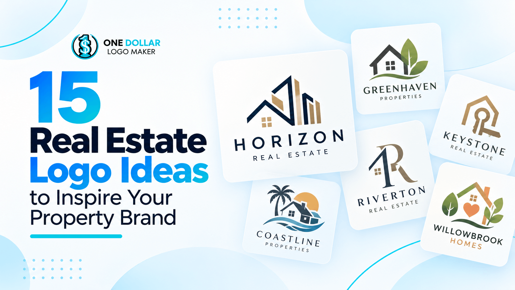
15 Real Estate Logo Ideas to Inspire Your Property Brand
A strong real estate logo does more than show that you work with properties. It can help communicate whether your business feels established, modern, approachable, luxurious, local, or highly specialized.
That means there is no single look that works for every agent, brokerage, developer, or property company. A luxury agency may benefit from restrained typography and an elegant color palette, while a residential business might prefer something warmer and more welcoming.
If you are looking for real estate logo ideas for a new business or considering an update to your current branding, the following design directions can help you decide what fits your brand.
1. Minimal Wordmark Logo
A wordmark keeps the focus on the business name rather than relying on a separate symbol. This can give a real estate brand a clean and confident appearance, particularly when the name itself is distinctive.
The typeface becomes especially important with this style. Spacing, capitalization, font weight, and subtle custom details can make a relatively simple logo feel much more recognizable.
Minimal wordmarks can work well for independent agents, brokerages, property consultants, and companies that want their branding to remain versatile across websites, signs, business cards, and social media.
SERHANT.
2. Elegant Serif Logo
Serif fonts can give a property brand a more refined and established look. Their traditional details are often associated with experience, professionalism, and sophistication.
This direction is particularly suitable for luxury real estate companies, established brokerages, high-end developments, and businesses working with premium properties.
Colors such as black, deep blue, dark green, cream, or muted metallic tones can complement this style, although the overall design usually benefits from keeping the palette restrained.
Christie’s International Real Estate
3. Modern Sans-Serif Logo
For a cleaner and more contemporary approach, a sans-serif typeface can be a strong starting point.
Modern sans-serif logos tend to use straightforward lettering, balanced spacing, and relatively simple layouts. This makes them suitable for businesses that want to appear current without relying on design trends that may quickly become outdated.
They can work for real estate agencies, property technology companies, developers, rental platforms, and other modern property businesses.
Compass
4. Monogram or Initial Logo
If your business has a long name, a monogram can turn the initials into a compact and recognizable brand mark.
Initials may be arranged side by side, stacked, enclosed within a shape, or combined into a custom symbol. The result can be easier to use in small spaces such as social media profile images, property signs, email signatures, and business cards.
This approach can be especially useful for individual agents and real estate teams whose names are central to the business.
Letter D Real Estate Logo Template
5. Abstract Real Estate Logo
A real estate logo does not necessarily need to contain a house, building, or key.
Abstract symbols provide another way to create a connection with the business. Geometric shapes, negative space, lines, and custom icons can suggest ideas such as movement, growth, connection, structure, or location without representing a property literally.
This can be a good direction for companies that want a more distinctive property logo design and prefer to avoid familiar real estate imagery.
Letter A Real Estate Logo Template
Abstract Roofing House Logo Template
Geometric Real Estate Logo Template
6. Architectural Logo
Architecture provides plenty of inspiration for real estate branding.
Arches, windows, columns, building outlines, structural lines, and geometric forms can all reference property while giving the designer more room to create something distinctive.
The style can also be adjusted to suit the business. Fine lines and classic architectural details may create a more elegant impression, while bold geometric structures can make the same concept feel modern.
Luxury Homes Real Estate Logo for Premium Residential Properties and Logo Template
Real Estate Prime Logo Template
Negative Space Real Estate Logo Template
Architecture Building Icon Logo Template
7. Location-Inspired Logo
For businesses strongly associated with a particular market, location can become part of the visual identity.
A logo might draw inspiration from a recognizable skyline, mountain range, coastline, local architecture, landscape, or another feature connected to the area.
The reference does not have to be literal. Even a simplified shape or subtle visual detail can help establish a sense of place.
This approach can be particularly useful for local agencies that want their branding to reinforce their knowledge of a specific community or region.
Mountain Real Estate Logo Template
Modern Structure Hut Logo Template
Beach House Real Estate Logo Template
Plowed Fields Vintage Logo Template
8. Luxury Real Estate Logo
Luxury branding often works best when it does not try to include too much.
Instead of using multiple icons, decorative elements, and colors, many premium-looking logos rely on carefully selected typography, generous spacing, and a limited palette.
Serif fonts, thin lettering, monograms, and subtle geometric details can all contribute to an upscale appearance. Black, cream, navy, charcoal, and understated metallic-inspired colors are also common choices.
The goal is usually to create a polished identity rather than simply adding traditionally luxurious symbols.
Royal Castle Home Logo Template
9. House-Inspired Logo
Houses and rooftops are some of the most recognizable symbols in real estate, which also means they are among the most commonly used.
That does not mean they need to be avoided entirely.
A house symbol can still work when it has a distinctive shape, unusual composition, clever negative space, or another feature that separates it from generic property logos. It can also be combined with typography rather than serving as the entire identity.
For residential businesses in particular, the immediate connection with homes can be useful.
Real Estate Roof Logo Template
Real Estate Foundation Logo Template
Door Real Estate Logo Template
10. Key or Door Logo
Keys and doors can symbolize access, ownership, moving, and finding a new home, making them natural visual ideas for real estate businesses.
Because these symbols are also widely used, simplicity can help. Rather than placing a detailed key beside the company name, for example, the shape could be incorporated into a letter or combined with another graphic element.
Doorways and entrances can also provide a slightly less obvious alternative while keeping the connection to property clear.
Friendly Real Estate Key Logo Template
KEY Real Estate Housing Logo Template
11. Nature-Inspired Property Logo
Not every property business is centered on city apartments or traditional suburban homes.
Trees, leaves, mountains, landscapes, and other natural elements can work well for companies connected with land sales, rural properties, vacation homes, sustainable developments, or communities surrounded by nature.
These elements can also help create a more relaxed or welcoming brand identity.
Greens, earthy neutrals, and blues are natural choices, but the symbol itself is usually more important than following an expected color palette.
Eco Community Home Logo Template
Canadian Home with Maple Leaf Logo Template
Nature Home Leaf Logo Template
12. Bold Geometric Logo
Strong geometric shapes can give a real estate brand a structured and contemporary appearance.
Squares, rectangles, triangles, lines, and custom combinations can reference buildings and architecture without showing them directly. They also tend to reproduce well across different sizes and formats.
This style may suit developers, commercial property companies, investment firms, construction-related real estate businesses, and brands looking for a more corporate visual identity.
ORBIT Real Estate Commercial Logo Template
13. Personal Real Estate Agent Logo
For an individual agent, the person behind the business is often an important part of the brand.
A name-led logo can reflect this by making the agent's name the main visual element. Initials, signatures, monograms, or distinctive typography can then add personality without making the logo too complicated.
This can be particularly effective when the agent already builds their marketing around their personal name, including on property listings, signs, social media, and printed materials.
Real Estate Agent Logo Template
14. Commercial Real Estate Logo
Commercial property businesses often need a different visual tone from residential agencies.
A structured layout, bold typography, geometric symbol, or architectural motif can create a more corporate appearance suited to businesses dealing with offices, industrial properties, retail spaces, investment, and development.
Dark blues, neutral shades, black, and other restrained colors can support this direction, although the best palette ultimately depends on the wider brand identity.
Commercial Real Estate Office Logo for Corporate Property and Business Logo Template
15. Friendly Residential Logo
A residential real estate business does not always need to look highly formal.
Rounded typefaces, softer shapes, warm colors, and simple illustrations can create a more approachable identity for businesses working with homeowners, families, renters, or first-time buyers.
The key is maintaining enough simplicity for the logo to remain professional. A friendly brand can still look polished without relying on overly playful graphics.
Family Care House Logo Template
How to Choose a Real Estate Logo Style
Think About Your Target Clients
A brand serving luxury property investors may need a different identity from an agent specializing in first-time homebuyers.
Consider the types of properties you handle, where you operate, and the clients you most want to attract. Your logo should support that positioning rather than simply following a design trend.
Choose Symbols Carefully
You do not have to avoid traditional real estate symbols such as houses, buildings, roofs, doors, and keys. The more important question is whether your version feels distinctive enough to represent your business.
You can also explore architectural, geographic, abstract, or typographic ideas if you want something less literal.
Keep the Logo Easy to Recognize
Real estate logos appear in many different places, from large property signs to small social media icons.
Avoid including so many details that the design becomes difficult to understand when reduced in size. Simple forms and readable typography generally make a logo easier to use consistently.
Consider Your Colors and Fonts Together
Color and typography can significantly change the personality of the same basic logo.
Serif typography may create a more traditional or refined impression, while sans-serif fonts often appear cleaner and more contemporary. Likewise, dark or neutral palettes can feel restrained, while brighter colors may make a brand appear more energetic or approachable.
Rather than choosing each element separately, consider how the font, color, symbol, and layout work together.
Make Sure the Design Can Grow With the Business
Your logo may eventually appear on websites, property listings, printed materials, advertising, social graphics, office signage, and other branded assets.
Choose a design that is flexible enough to work across those formats and still make sense as the company grows or expands into new services.
Creating Your Own Real Estate Logo
The best real estate logo ideas are not necessarily the most complicated ones. A clear name, suitable typography, thoughtful colors, and one memorable visual idea can often be enough to create a strong identity.
Start by deciding what you want potential clients to associate with your business. From there, you can explore different logo templates, symbols, fonts, and color combinations until you find a direction that fits.
Whether you prefer a minimal wordmark, a luxury monogram, a familiar house symbol, or a more abstract concept, the goal is to create a logo that feels appropriate for the property brand behind it.
Frequently Asked Questions
What makes a good real estate logo?
A good real estate logo is easy to recognize, readable at different sizes, and consistent with the type of clients and properties the business serves. It should also be flexible enough to work across websites, signs, business cards, social media, and other marketing materials.
What colors are best for a real estate logo?
There is no single best color for real estate branding. Blue can create a professional appearance, black and neutral colors are often associated with more refined branding, and greens or earthy colors can complement property businesses connected with land or nature. The right choice depends on the personality you want the brand to communicate.
What symbols can you use in a real estate logo?
Common choices include houses, rooftops, buildings, doors, keys, windows, skylines, location markers, architectural details, and monograms. Abstract and geometric symbols can also work well if you want a less literal design.
Should a real estate logo include a house?
No. A house can make the nature of the business immediately recognizable, but it is only one option. Typography, initials, abstract shapes, architecture, or location-inspired graphics can communicate a strong real estate identity without including a house.
What font works best for a real estate logo?
The best font depends on the brand style. Serif fonts can create a more traditional or sophisticated appearance, while sans-serif fonts are often suited to modern and minimalist branding. Whichever style you choose, readability should remain a priority, especially when the logo will appear at smaller sizes.