12 Common Logo Design Mistakes (And How to Fix Them)
A logo does not have to be complicated to be effective. In fact, many logo design mistakes happen when too many ideas, colors, fonts, or details are added to a design that would work better with less.
Other problems are less obvious. A logo may look fine on a large screen but become unreadable as a social media icon. A symbol may look professional but have little connection to the business. Even a good-looking design can cause problems if it is too similar to competitors or relies heavily on a short-lived trend.
Whether you are creating a logo from scratch or reviewing an existing one, these common logo mistakes are worth checking before you finalize the design.
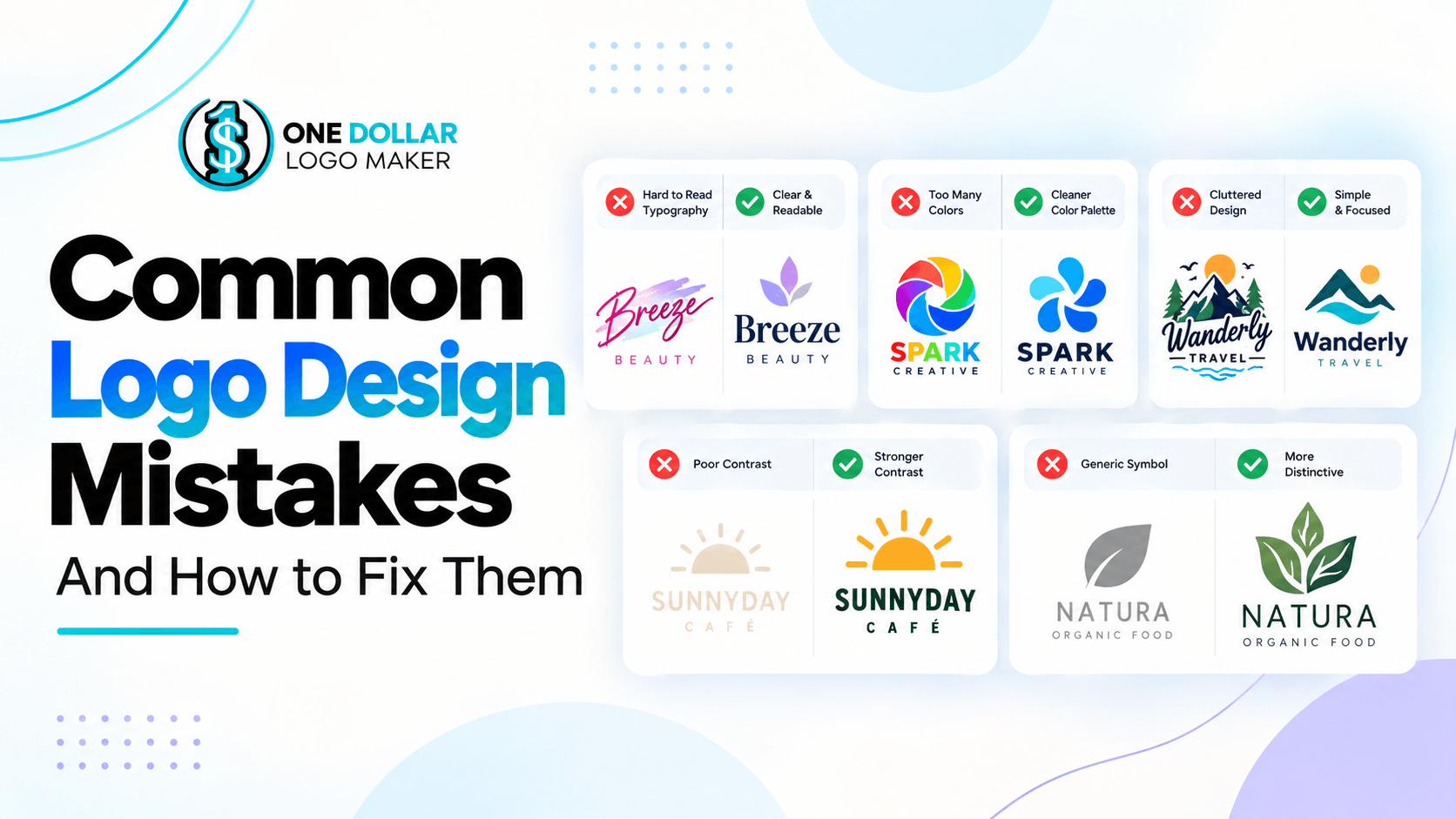
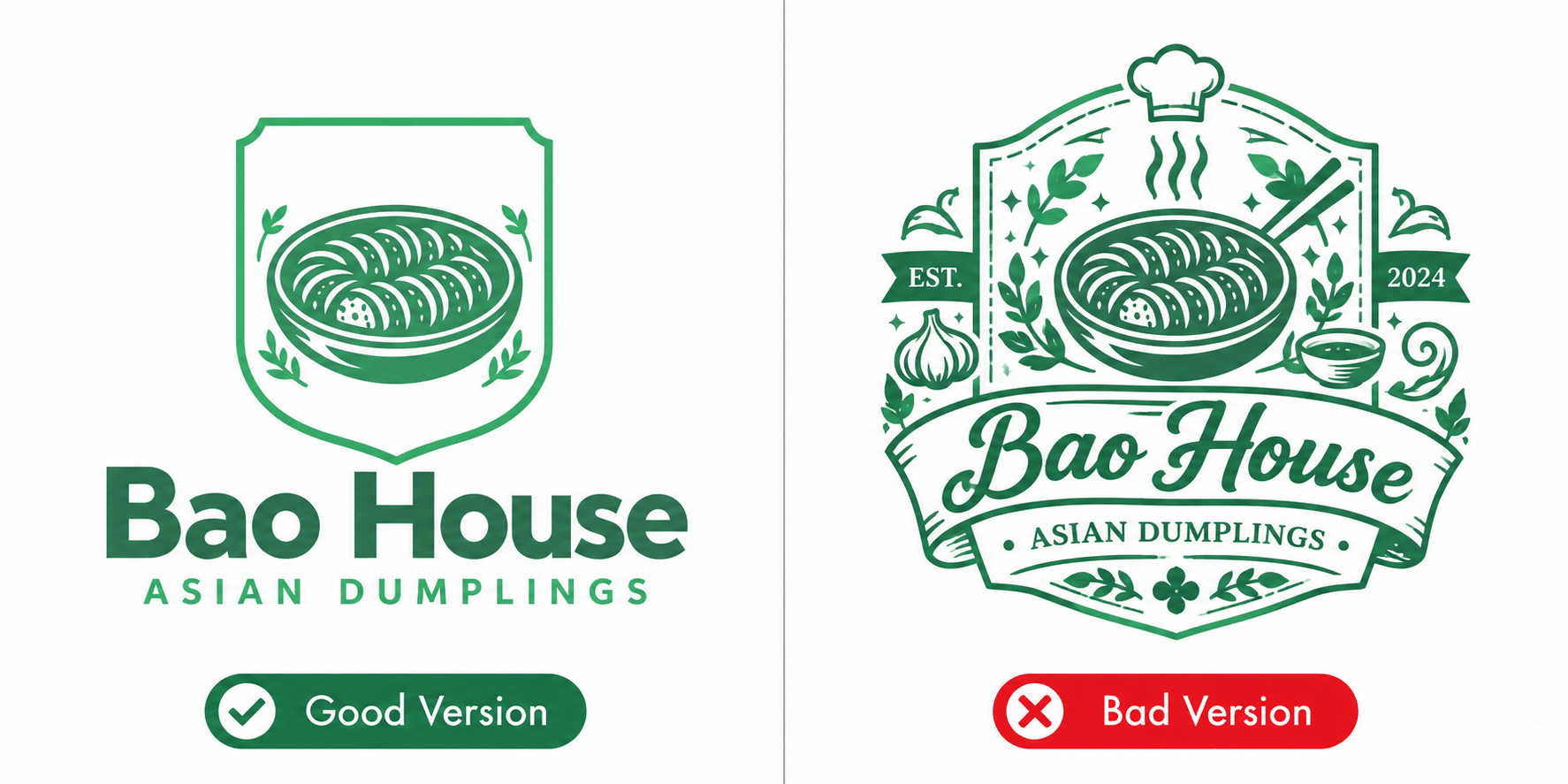
1. Adding Too Much Detail
One of the most common logo design mistakes is trying to communicate too much in a single mark.
Small illustrations, multiple symbols, decorative lines, shadows, gradients, and extra text can quickly make a logo feel cluttered. Those details may look impressive when the logo is displayed at a large size, but they often disappear when it is reduced.
A complicated logo can also be harder for people to recognize quickly.
How to fix it
Remove anything that does not play an important role in the identity. Try reducing the design to one main symbol, the brand name, and only the supporting details that are genuinely necessary.
A useful test is to shrink the logo significantly. If important parts become difficult to distinguish, simplify them.
2. Using Fonts That Are Hard to Read
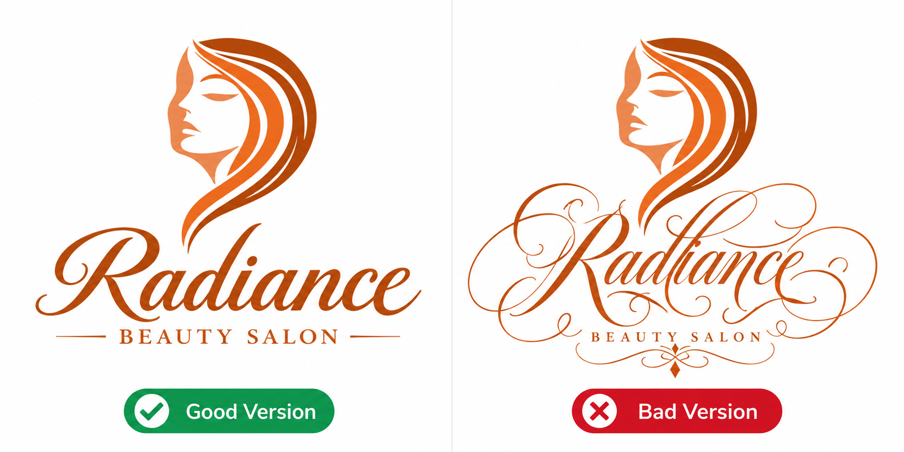
Decorative fonts can give a logo personality, but readability still needs to come first.
Extremely thin lettering, complicated scripts, unusual character shapes, or tightly spaced text can make a business name difficult to understand. This becomes an even bigger problem when the logo appears on a phone screen, business card, social profile, or small advertisement.
If someone needs several seconds to work out what the brand name says, the typography is probably working against the logo.
How to fix it
Choose a font that fits the brand while remaining easy to recognize at different sizes. Script and decorative fonts can still work, but they are usually better when the lettering remains relatively simple.
Also check letter spacing and the distance between words.
3. Using Too Many Fonts
Even when every individual font is readable, combining too many of them can make a logo look inconsistent.
For example, a logo that uses one font for the brand name, another for a tagline, a third for initials, and a fourth inside the symbol may struggle to feel like one cohesive design.
How to fix it
Limit the logo to one or two complementary typefaces in most cases.
You can create variation through font weight, size, capitalization, or spacing instead of introducing another typeface every time you need visual contrast.

4. Choosing Colors Without Enough Contrast
Two colors may look attractive separately but become difficult to distinguish when placed together.
Low contrast can make text difficult to read and cause parts of a symbol to disappear. This is especially important for small logos and designs that may appear on different backgrounds.
How to fix it
Check whether there is enough visual separation between the main elements. Beyond contrast, consider color meanings and how the combination supports the impression you want the brand to create.
Try the logo on both light and dark backgrounds. It is also useful to create a black-and-white version. If the design only works with one very specific background or color combination, it may need adjustment.

5. Using Too Many Colors
Color can make a logo more memorable, but adding more colors does not automatically make a design stronger.
A large palette can make the logo busy and create additional problems when it needs to be reproduced consistently across websites, printing, signage, merchandise, and other materials.
How to fix it
Start with a limited palette.
Two or three main colors are often enough, although there is no rule saying every logo must use exactly that number. The important thing is that every color has a reason to be there.
You can always build a larger brand palette around the logo later.

6. Choosing a Generic or Overused Symbol
Houses for real estate companies, light bulbs for creative businesses, globes for international companies, and leaves for environmentally focused brands are all understandable choices.
The problem is not necessarily the symbol itself. The problem comes when it is used in exactly the same way as hundreds of other brands.
A generic icon can make an otherwise professional logo difficult to distinguish from competitors.
How to fix it
Look for ways to give a familiar symbol a more distinctive treatment.
You might change the shape, combine it with another relevant idea, incorporate negative space, or integrate it into the typography.
The symbol should still make sense, but it should not feel like the first stock icon someone would choose for the industry.
7. Using Imagery That Does Not Fit the Business
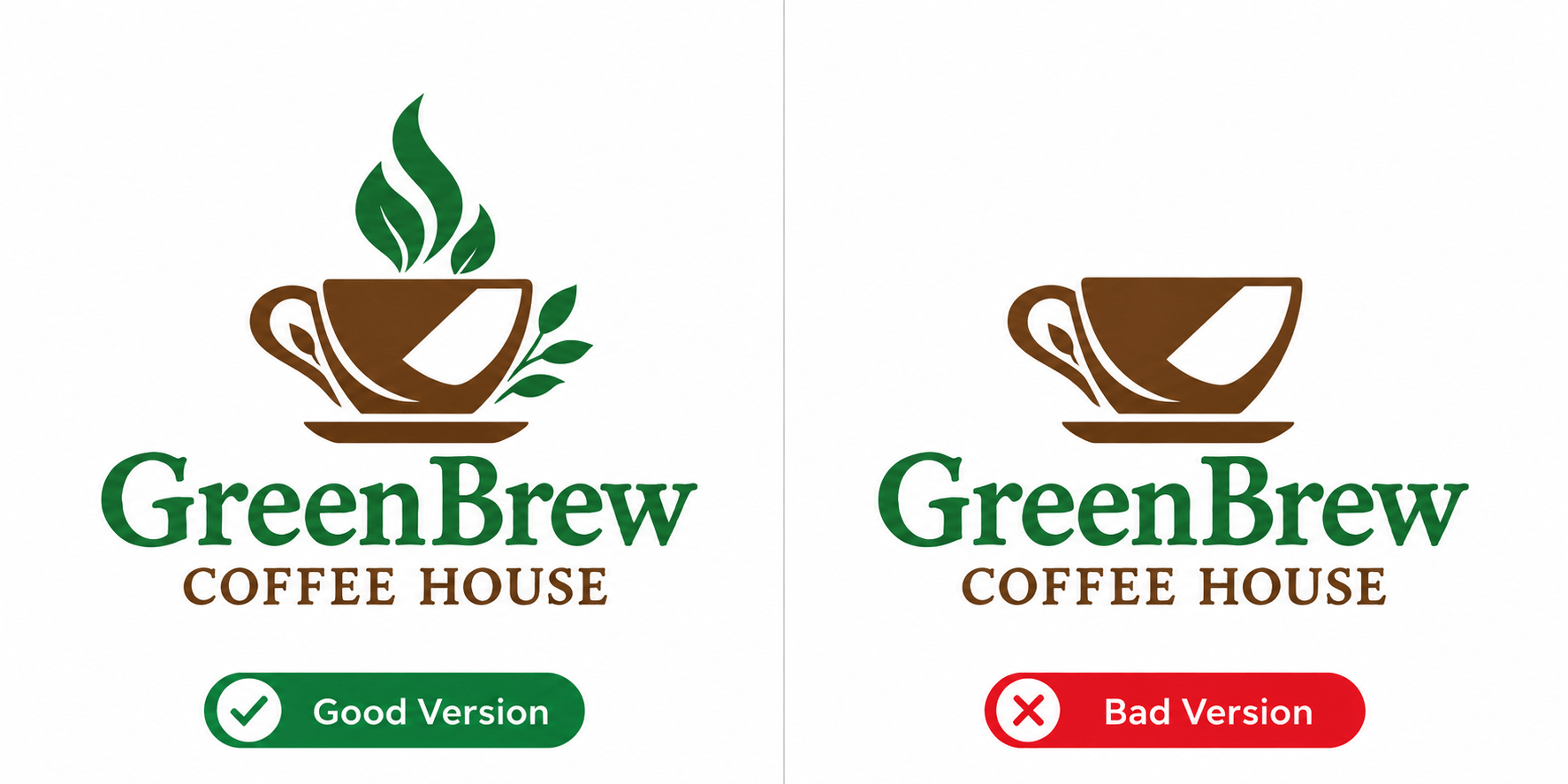
A visually attractive symbol is not automatically a suitable logo.
If the imagery has little connection to the business, customers may misunderstand what the company does. The issue can also be subtler: an icon may be related to the broader industry but suggest the wrong service.
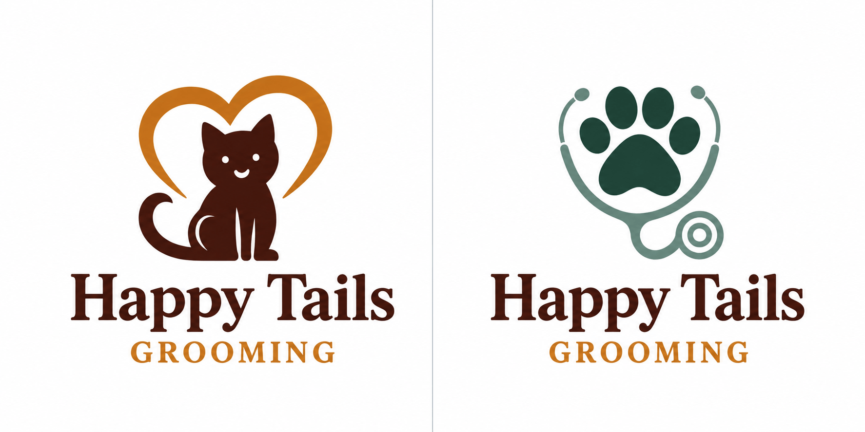
For example, a pet business could use an icon that looks appropriate at first glance but makes a grooming service look more like a veterinary clinic.
How to fix it
Ask what the symbol communicates before deciding whether to use it.
It does not always need to represent the product literally. Abstract logos can work extremely well. However, the idea behind the symbol should still connect with the brand's identity, personality, industry, or service.
8. Ignoring Scalability
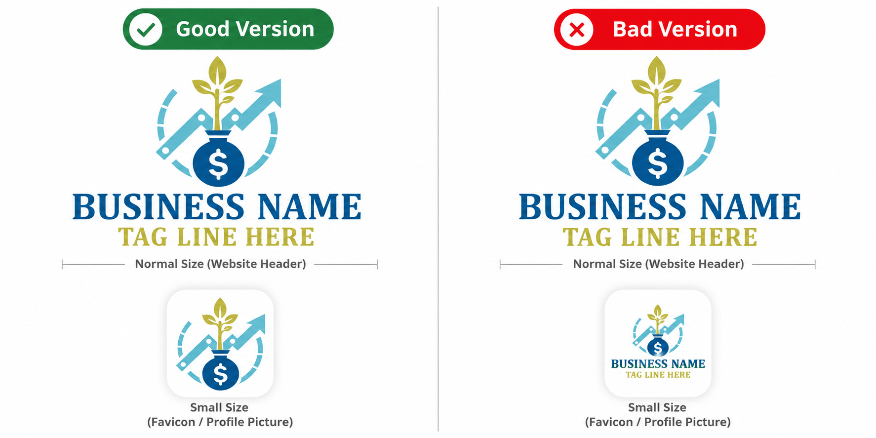
A logo may appear on something as large as a storefront and something as small as a browser favicon.
Designing only for the large version is a common mistake.
Thin lines may disappear. Small text may become unreadable. Detailed illustrations may turn into an indistinguishable shape.
How to fix it
Test the logo at several sizes before finalizing it.
You may also need simplified variations. For example, the full logo could appear in a website header while a compact symbol is used for a favicon or social media profile image.
A strong logo system does not necessarily mean using exactly the same configuration everywhere.
9. Giving Every Element Equal Attention
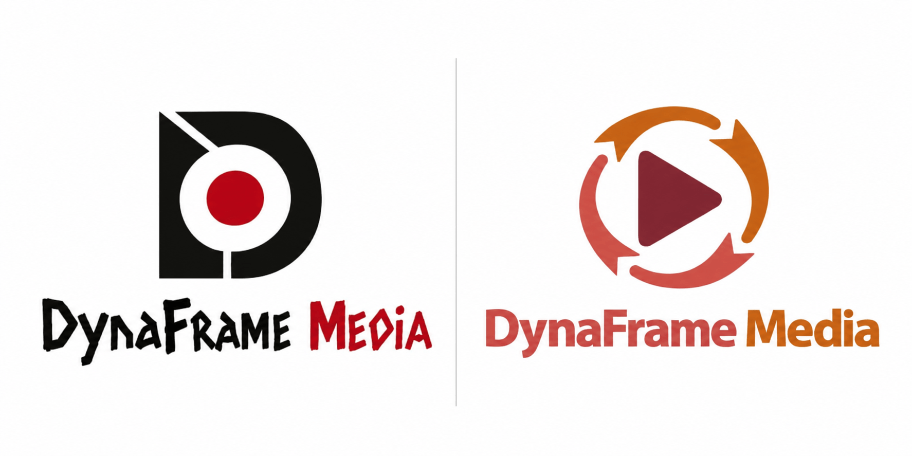
When the business name, icon, tagline, and other elements all compete for attention, the viewer may not know where to look first.
This is a hierarchy problem.
Usually, one element should lead the design. In many logos, that is the brand name or primary symbol, while supporting information such as a tagline receives less emphasis.
How to fix it
Decide what people should notice first.
Use differences in size, weight, spacing, and placement to establish a clear hierarchy. Supporting text should support the identity rather than compete with it.

10. Relying Too Heavily on Design Trends
Current logo trends can provide inspiration, but following them too closely can date a logo quickly.
A certain gradient style, font treatment, icon shape, or visual effect may suddenly appear everywhere. If the entire identity depends on that trend, the logo may begin to look outdated once tastes change.
How to fix it
Use trends selectively rather than building the entire identity around them. It is usually more useful to choose a logo style that reflects the brand’s personality and positioning than to follow whatever look is currently popular.
Focus first on readability, simplicity, brand relevance, and versatility. Trend-driven elements can then be added where they genuinely improve the design.
The goal is not to make a logo completely timeless. It is to avoid making it dependent on a style that may disappear quickly.

11. Designing a Logo That Looks Too Similar to Competitors
Looking at competitor logos is useful. Copying the patterns you see repeatedly is not.
If every company in an industry uses the same colors, icon, layout, and typography, adopting exactly the same formula makes it much harder for a new brand to stand out.
It can also create confusion if two logos appear side by side.
How to fix it
Review competitors before finalizing the logo and identify the design patterns that dominate your industry.
You do not necessarily need to do the opposite of everything competitors are doing. Instead, find at least one element that gives your brand its own identity, whether that is the symbol, color palette, typography, layout, or overall style.
12. Forgetting How the Logo Will Be Used
A logo is rarely created for just one place.
It may eventually appear on websites, social media, packaging, invoices, signs, presentations, business cards, advertisements, uniforms, and many other branded materials.
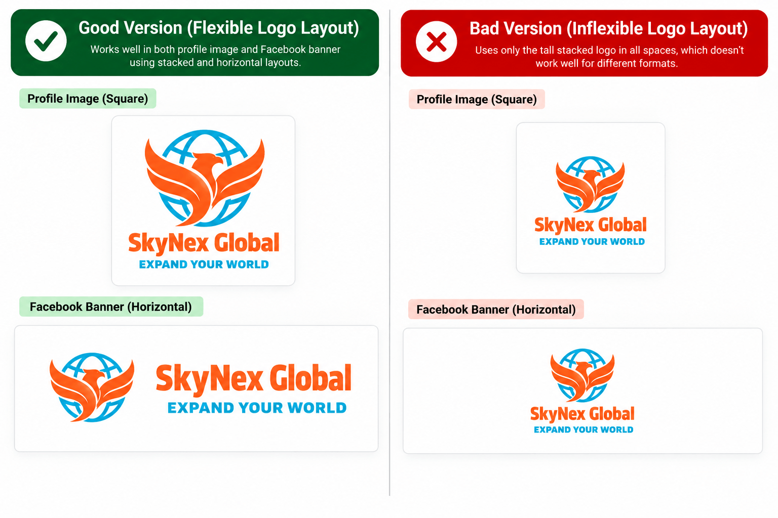
A design that only works in one horizontal or stacked arrangement can become difficult to use.
How to fix it
Test the logo in realistic situations before approving it.
Consider whether you need a horizontal version, stacked version, icon-only version, light and dark variations, or a single-color version.
You do not need dozens of versions, but having a few practical variations can make the identity much easier to use consistently.
How to Check Your Logo Before Finalizing It
Before choosing a final design, review it as if you were seeing the brand for the first time. If you are creating a logo using AI, the same review is important because the first generated result may still need adjustments before it is ready to use.
Ask whether the name is easy to read, whether the symbol makes sense, and whether any details could be removed without losing the idea. You can also compare different logo templates to see how changes in layout, typography, color, and symbols affect the overall result. Then test the logo at different sizes and on different backgrounds.
It can also help to compare several logo concepts side by side. Looking at different options makes it easier to identify which design has the clearest hierarchy, strongest brand connection, and best overall versatility.
Most bad logo design is not caused by one dramatic mistake. More often, several smaller issues combine to make the logo less effective.
Fixing those problems early can result in a design that is simpler, clearer, and easier to use across the entire brand.
Frequently Asked Questions
What are the most common logo design mistakes?
Common mistakes include using too many details, choosing difficult-to-read fonts, adding too many colors, using generic symbols, creating poor contrast, and failing to check whether the logo works at smaller sizes.
How do I know if my logo is too complicated?
Reduce the logo to a small size and see whether the main symbol and business name are still easy to recognize. If important details disappear or merge together, the design may benefit from simplification.
How many colors should a logo have?
There is no fixed number that works for every brand, but a limited palette is generally easier to manage. Many effective logos use only a few main colors and rely on a broader brand palette for other marketing materials.
Should a logo follow current design trends?
Trends can provide inspiration, but they should not determine the entire design. A logo still needs to suit the brand, remain readable, and work across different applications after the trend has passed.
How can I improve a bad logo design?
Start by identifying the specific problem rather than redesigning everything immediately. Simplifying details, improving typography, adjusting contrast, removing unnecessary colors, or choosing a more relevant symbol may be enough to make the logo considerably stronger.