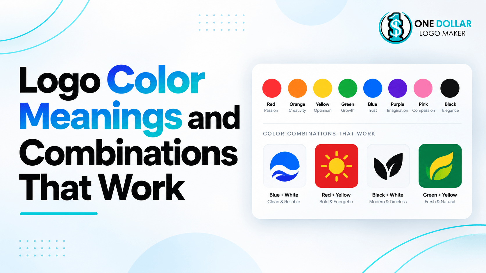
Logo Color Meanings and Combinations That Work
Color is one of the first things people notice about a logo. Before someone reads the business name or studies the symbol, the color palette can already influence whether the brand feels energetic, professional, natural, luxurious, playful, or dependable.
That does not mean every color has one fixed meaning. The way people interpret colors can change depending on the industry, audience, culture, shade, and the rest of the design. A bright red used by a fast-food company, for example, can create a very different impression from a deep red used by a luxury brand.
Understanding common logo color meanings can still give you a useful starting point. The goal is to choose colors that support the personality of your business and work well together across your website, packaging, social media, signage, and other brand materials.
This guide explains what common logo colors can communicate, shows examples from well-known brands, and covers practical color combinations you can consider for your own logo.
Why Do Logo Colors Matter?
A logo color does more than make the design look attractive. Over time, it can become part of how customers recognize and remember a brand.
Color can help communicate qualities such as:
Trust
Energy
Creativity
Luxury
Friendliness
Freshness
Simplicity
Strength
It can also help a business fit into or stand apart from its industry.
For example, blue is common among technology and financial brands because it often creates a calm and dependable impression. A company entering one of those industries could choose blue to feel familiar, or use a different color to stand out.
Color should not do all the work, though. Typography, imagery, layout, messaging, and customer experience all contribute to how a brand is perceived.
Logo Color Meanings and Examples
Red Logos: Energy, Confidence, and Attention
Red is one of the most noticeable colors and is commonly associated with energy, passion, excitement, confidence, and urgency.
It can be a strong choice for businesses that want to create an immediate impact.
Red often works well for:
Food and restaurants
Entertainment
Sports
Retail
Automotive businesses
Bold consumer brands
Coca-Cola is one of the best-known examples of red branding. Its strong red color contributes to an energetic and instantly recognizable identity.
Netflix also uses red prominently against darker backgrounds, creating a bold and dramatic appearance.

Because red can feel intense, it is often balanced with white, black, cream, or another neutral color.

Artistic Tropical Bird Logo Template
Colors that pair well with red: white, black, yellow, cream, navy.
Orange Logos: Friendly, Energetic, and Approachable
Orange combines some of the energy of red with the warmth of yellow. It is often associated with enthusiasm, creativity, friendliness, and accessibility.
It tends to feel energetic without being quite as intense as red.
Orange can work well for:
Food
Entertainment
Children's brands
Fitness
Creative businesses
Casual retail
Nickelodeon is a recognizable example. Its orange branding supports the company's playful and energetic personality.
The Home Depot also uses orange prominently, helping the brand stand out while maintaining an accessible, practical feel.

Colors that pair well with orange: navy, white, charcoal, brown, cream.
Yellow Logos: Optimism, Warmth, and Positivity
Yellow is commonly associated with optimism, happiness, friendliness, warmth, and attention.
Because it is bright and highly visible, yellow often appears in brands that want to feel upbeat and accessible.
It can work particularly well for:
Food
Retail
Children's products
Entertainment
Casual consumer brands
McDonald's is one of the most recognizable examples. Its yellow arches stand out strongly against the brand's red background.

Snapchat also uses a bright yellow background to create a youthful and highly recognizable visual identity.

Yellow usually needs strong contrast because light shades can be difficult to read against white.
Adorable Honey Bee Logo Template
Colors that pair well with yellow: black, red, navy, dark green, charcoal.
Green Logos: Nature, Growth, and Freshness
Green is strongly associated with nature, growth, freshness, health, and sustainability.
It is often used by businesses related to:
Food
Wellness
Sustainability
Agriculture
Outdoor products
Natural products
Financial growth
Starbucks uses a deep green as a central part of its identity.
Spotify uses a much brighter green, giving the brand a more energetic and digital feel.

This shows why the specific shade matters. Dark greens can feel established or natural, while brighter greens often feel more energetic and contemporary.

Colors that pair well with green: cream, white, brown, yellow, gold, navy.
Blue Logos: Trust, Calm, and Professionalism
Blue is one of the most common colors in business branding.
It is often associated with trust, stability, professionalism, security, and calm. These qualities make it particularly popular in industries where reliability matters.
Blue often works well for:
Technology
Finance
Healthcare
Software
Professional services
Corporate businesses
IBM has long used blue as a central part of its visual identity.

Visa also relies heavily on blue, which fits a category where trust and reliability are particularly important.

The shade can significantly change the impression. Light blue may feel friendly and calm, while navy can feel more established and authoritative.

Artistic Sky Flying Bird Logo Template
Colors that pair well with blue: white, gray, light blue, orange, yellow, gold.
Purple Logos: Creativity, Imagination, and Luxury
Purple is commonly associated with creativity, imagination, individuality, and luxury.
Darker shades can feel sophisticated and premium, while brighter purples tend to appear more playful or expressive.
Purple can work well for:
Beauty
Fashion
Entertainment
Creative businesses
Technology
Premium products
Cadbury is closely associated with a rich purple that helps give the brand a distinctive, premium appearance.
Twitch uses a brighter purple, which creates a much more digital, youthful, and energetic identity.

Lady Butterfly Feminine Logo Template
Colors that pair well with purple: white, pink, orange, gold, cream, navy.
Pink Logos: Playfulness, Care, and Personality
Pink can communicate very different things depending on the shade.
Soft pink can feel warm, calm, gentle, or caring. Brighter pinks and magentas can feel confident, youthful, expressive, and energetic.
Pink is often used in:
Beauty
Fashion
Lifestyle
Children's brands
Creative businesses
Entertainment
Barbie is one of the most recognizable examples of pink branding. The color has become closely connected with the brand's identity.
T-Mobile uses a much brighter magenta, showing how a pink-family color can also feel bold and modern rather than soft.

Forum Queen Royal Chat Platform and Discussion Logo Template
Colors that pair well with pink: black, white, burgundy, navy, purple, cream.
Black Logos: Sophistication, Strength, and Simplicity
Black is one of the most versatile logo colors.
It can communicate sophistication, confidence, simplicity, strength, and luxury. Because it is neutral, it also allows typography and logo shapes to take center stage.
Black often works well for:
Fashion
Luxury
Technology
Automotive brands
Professional services
Minimalist brands
Nike frequently uses a simple black version of its swoosh, reinforcing the strength of the symbol itself.
Chanel also uses black and white to create a clean, sophisticated identity.

Elegant Lion Fashion House Logo Template
Colors that pair well with black: white, gold, red, beige, silver.
White Logos: Simplicity, Cleanliness, and Clarity
White is usually used as a supporting color or negative space rather than as the only color in a logo.
It is associated with simplicity, clarity, cleanliness, and minimalism.
White works especially well when paired with stronger colors because it creates contrast and gives the design room to breathe.
For example, Nike often uses a white swoosh on dark backgrounds.
Many businesses also create both dark and light versions of their logo so the design remains visible on different backgrounds.
Colors that pair well with white: almost any strong or dark color, especially black, blue, red, green, and navy.
Gray and Silver Logos: Balance, Neutrality, and Modernity
Gray tends to feel more understated than black.
It is often associated with neutrality, maturity, balance, professionalism, and practicality. Metallic silver can also give a logo a more modern or technical appearance.
Gray and silver are common in:
Automotive branding
Technology
Architecture
Corporate businesses
Professional services
Mercedes-Benz frequently uses silver or monochrome versions of its three-pointed star.

Apple has also used gray, silver, black, and white versions of its logo across different products and applications.

Gray often works best with a stronger accent color when a brand wants more personality.

Colors that pair well with gray: blue, teal, white, black, orange, red.
Brown Logos: Warmth, Reliability, and Natural Appeal
Brown is closely connected with earth, wood, coffee, leather, and other natural materials.
It can make a brand feel warm, dependable, practical, traditional, or handcrafted.
Brown often works well for:
Coffee businesses
Bakeries
Outdoor brands
Furniture
Natural products
Artisan businesses
Heritage-inspired brands
UPS is one of the most recognizable brands to use brown as a central color.
Its combination of brown and gold also gives the identity a more established and distinctive look.

Cute Girl Gamer Headset Mascot Logo Template
Colors that pair well with brown: cream, gold, green, beige, orange, white.
Logo Color Meanings at a Glance
Color | Common associations | Often works well for |
Red | Energy, passion, confidence | Food, entertainment, sports |
Orange | Friendliness, warmth, creativity | Food, fitness, casual brands |
Yellow | Optimism, positivity, attention | Food, retail, youth brands |
Green | Nature, growth, freshness | Health, sustainability, food |
Blue | Trust, stability, professionalism | Technology, finance, healthcare |
Purple | Creativity, luxury, imagination | Beauty, entertainment, premium brands |
Pink | Playfulness, care, personality | Beauty, lifestyle, creative brands |
Black | Strength, luxury, simplicity | Fashion, luxury, technology |
White | Clarity, cleanliness, simplicity | Minimal and modern branding |
Gray | Balance, neutrality, professionalism | Corporate, automotive, technology |
Brown | Warmth, reliability, natural appeal | Coffee, artisan, outdoor brands |
Logo Color Combinations That Work
Individual colors matter, but the way colors work together can have an even bigger effect on the final design.
Here are some combinations used successfully by recognizable brands.
Red and Yellow: Energetic and Attention-Grabbing
Red and yellow are both highly visible, energetic colors.
Together, they create a warm and lively palette that works particularly well for brands that want to appear fast, accessible, and upbeat.
McDonald's is the most familiar example.

The red creates energy while the yellow arches provide strong contrast and immediate recognition.
This combination can work well for:
Food
Retail
Entertainment
Family-focused businesses
Because both colors are strong, keeping the rest of the logo relatively simple can prevent the design from becoming overwhelming.
Orange Doom Face Logo Template
Blue and White: Clean and Dependable
Blue and white is a popular combination for brands that want to appear clean, professional, calm, and trustworthy.
Visa uses blue prominently with white backgrounds and negative space.

White helps the blue remain clear and gives the overall design a more open appearance.
This palette works particularly well for:
Finance
Technology
Healthcare
Professional services
Software
Abstract Triangle Fold Logo Template
Green and Yellow: Fresh and Energetic
Green and yellow combine natural associations with a brighter, more optimistic feeling.
Subway uses both colors prominently in its wordmark.

The palette feels fresh and accessible, which fits a food brand positioned around customizable meals and fresh ingredients.
John Deere is another recognizable example of green and yellow branding.
This combination can work for:
Food
Agriculture
Outdoor brands
Sustainability
Family-oriented businesses
Bamboo Earth Leaf Logo Template
Purple and Orange: Creative and Distinctive
Purple and orange create strong contrast while maintaining a creative and energetic feel.
FedEx is a well-known example. Its wordmark uses purple with orange in the FedEx Express identity.

The combination feels distinctive without relying on traditional corporate colors such as blue or gray.
It can work particularly well for:
Creative businesses
Delivery and logistics
Entertainment
Technology
Youth-oriented brands

Podcast Wings Sound Logo Template
Black and White: Timeless and Versatile
Few combinations are as flexible as black and white.
The high contrast keeps logos easy to recognize while creating a clean, confident appearance.
Chanel is a strong example.

Nike also frequently uses black-and-white versions of its identity.
This combination can suit almost any industry but is particularly common in:
Fashion
Luxury
Technology
Professional services
Minimalist branding
It also has the practical advantage of being easy to reproduce across digital and printed materials.
Dark Blue and Light Blue: Professional but Approachable
Using two shades from the same color family creates harmony without requiring a completely different accent color.
PayPal uses overlapping shades of blue in its visual identity.
The darker blue adds stability while the lighter blue keeps the design feeling modern and approachable.
This type of palette works well for:
Technology
Finance
Healthcare
Consulting
B2B services
Creative Fluid Motion Splash Logo for Unique Brands Logo Template
Blue and Yellow: Reliable but Optimistic
Blue and yellow combine the stability of blue with the warmth and energy of yellow.
IKEA is a highly recognizable example.
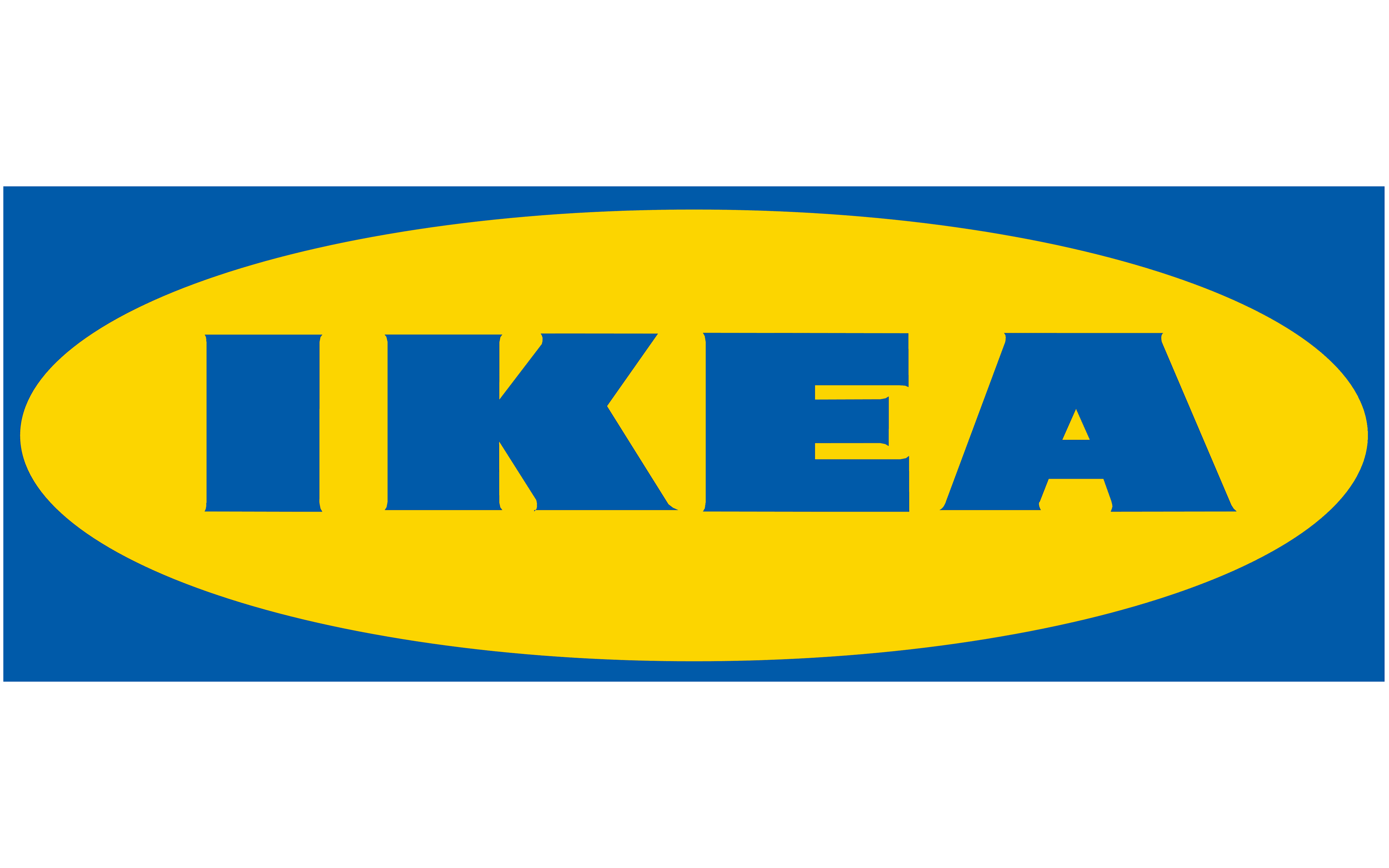
The blue provides strong contrast and dependability, while the yellow keeps the identity bright and approachable.
This combination can be particularly useful for:
Retail
Family-focused businesses
Home and lifestyle brands
Consumer services
Sleepy Bear Warm Nest Logo Template
Flowing Leaf Swirl Logo Template
Brown and Gold: Established and Warm
Brown and gold can create a more traditional and dependable feel.
UPS uses this combination prominently.
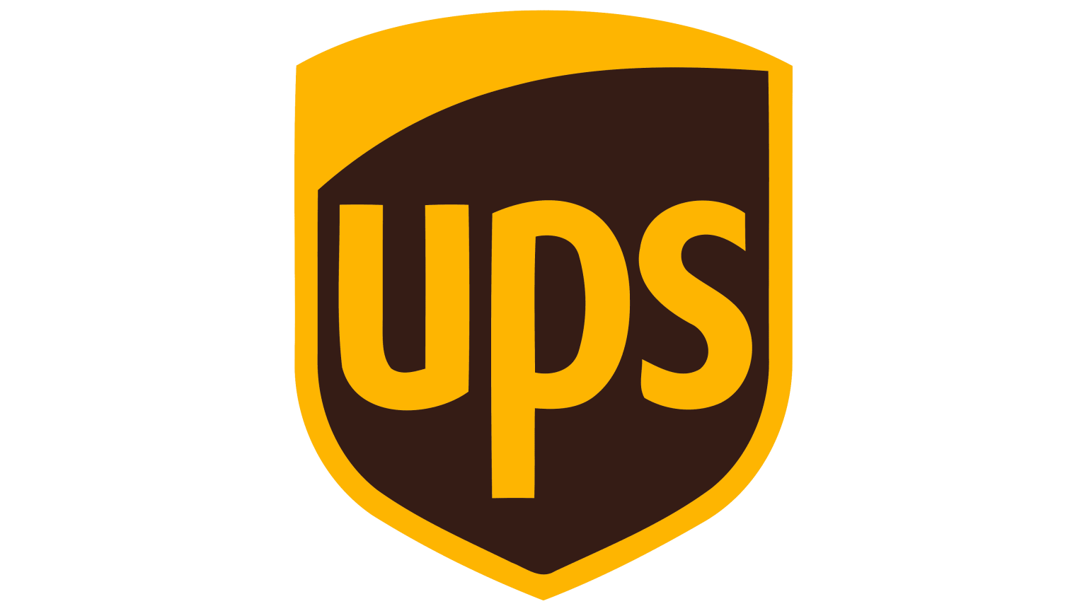
The brown gives the identity stability and warmth, while the gold adds contrast and a slightly more premium quality.
This combination can work for:
Delivery services
Heritage brands
Artisan businesses
Coffee
Hospitality
Premium natural products
Evergreen Honey Bee Logo Template
How Many Colors Should a Logo Have?
There is no exact number that every logo should follow, but many businesses only need one or two main colors.
A simple palette is often easier to:
Recognize
Reproduce
Use consistently
Adapt to different backgrounds
Apply across websites and printed materials
A common approach is to use:
One primary color + one secondary color + a neutral
For example:
Blue + light blue + white
or:
Burgundy + cream + black
Multicolor logos can work too. Google and Microsoft are obvious examples.



Palette Colorful Logo Template
However, adding more colors should serve a purpose. If several colors do not improve the design or communicate something meaningful, a simpler palette may be more effective.
How to Choose the Right Logo Colors for Your Brand
Logo color meanings can help narrow your options, but the final decision should reflect the complete brand.
Start With Your Brand Personality
Think about the impression you want the business to create.
For example:
Trustworthy: blue
Energetic: red or orange
Natural: green or brown
Premium: black, deep purple, or burgundy
Playful: yellow, pink, orange, or bright purple
These are starting points rather than rules.
A luxury brand does not have to use black, just as a sustainable business does not have to use green.
Consider Your Industry
Look at the colors competitors commonly use.
This can help you understand what customers may already expect.
A financial business, for example, may find that many competitors use blue. Choosing blue could make the business feel familiar and trustworthy, while choosing a different palette could help it stand out.
Neither approach is automatically better.
Consider whether you want your branding to fit naturally into the category or create more visual differentiation.
Think About Your Audience
Different audiences may respond differently to the same colors.
Age, culture, location, and personal experiences can all influence how colors are interpreted.
A bright and playful palette may suit a children's brand but feel out of place for a corporate legal service.
Choose colors with the people you are trying to reach in mind.
Check the Contrast
Your logo should remain easy to see and read.
Avoid combinations where the colors are too similar in brightness or tone.
Check how the design appears:
On white
On dark backgrounds
At small sizes
In grayscale
Good contrast can improve both readability and versatility.
Think About Where the Logo Will Be Used
Your logo may appear on more than a website.
It could eventually be used on:
Packaging
Business cards
Social media
Signs
Uniforms
Merchandise
Printed advertisements
Colors can appear differently on screens and in print, so make sure the final palette works across the formats your business actually needs.
Should You Follow Logo Color Psychology Exactly?
No.
Color psychology can be useful, but it should not be treated as a strict formula.
Blue does not automatically make a brand trustworthy. Red does not automatically create excitement. Green does not make a company environmentally responsible.
The overall impression comes from the combination of:
Color
Typography
Imagery
Layout
Brand name
Messaging
Industry
Customer experience
Context matters.
That is also why recognizable brands can sometimes use colors in unexpected ways successfully. They build meaning around the color over time rather than relying on the color alone to communicate the entire brand.
Use common color associations to guide your choices, but make the final decision based on what fits your business as a whole.
Explore Logo Colors With One Dollar Logo Maker
If you are still unsure which colors work for your business, comparing different logo designs can help you visualize your options.
With One Dollar Logo Maker, you can browse logo templates across different industries, choose a design that fits your brand, and customize elements such as the colors, fonts, text, and layout.
Experimenting with several color options before settling on one can help you see how much the personality of the same logo can change with a different palette.
If you are still deciding on the overall design direction, read our guide on how to choose a logo style for your business before choosing your colors.
Frequently Asked Questions About Logo Colors
What is the best color for a business logo?
There is no single best logo color for every business.
The right color depends on your industry, target audience, brand personality, competitors, and the impression you want to create.
Blue may work well for a business that wants to communicate stability and professionalism, while orange could better suit a brand that wants to feel energetic and approachable.
How many colors should I use in a logo?
One or two main colors are enough for many logos.
You can also include a neutral such as white, black, cream, or gray. Keeping the palette relatively simple can make the logo easier to recognize and use consistently.
What colors make a logo look professional?
Almost any color can look professional when it fits the business and is used well.
Blue, navy, black, gray, and white are commonly used in professional branding, but brighter colors can also work when they suit the brand personality and industry.
What colors make a logo look luxurious?
Black and gold are commonly associated with luxury, but other options include deep burgundy, dark green, navy, cream, and rich purple.
Typography, spacing, and overall design also contribute to whether the logo feels premium.
Should my logo colors be different from my competitors?
Not necessarily.
Using familiar industry colors can help customers quickly understand what kind of business you are. Using a different palette can help you stand out.
Review what competitors are doing, then decide whether familiarity or differentiation better supports your brand.