How to Choose a Logo Style for Your Business
Choosing a logo is one of the first visual branding decisions a business has to make. A logo can appear on your website, social media profiles, packaging, signage, business cards, advertisements, and other brand materials, so the design needs to do more than simply look good.
The right logo should fit your business name, industry, audience, and overall brand personality. It should also be practical enough to work in the places where customers are most likely to see it.
There are several common types of logos, and each has different strengths. Understanding how they work can make it easier to choose a design that fits your business rather than simply picking a style because it looks appealing.
In this guide, we’ll explain the main logo types, show familiar examples, and help you decide which one may work best for your brand.
Logo Type vs. Logo Style: What’s the Difference?
Logo type and logo style are closely related, but they are not the same thing.
A logo type refers to the basic structure of the logo. For example, a logo might use the full business name, initials, a standalone icon, a mascot, or a combination of text and imagery.
A logo style, on the other hand, describes how the design looks and feels. A logo can be minimalist, modern, elegant, playful, vintage, bold, hand-drawn, or something else.
For example, a bakery could use a combination mark as its logo type while giving the design an elegant or vintage visual style.
Choosing the right logo usually means thinking about both: the structure that works best for the business and the visual style that best reflects the brand.
7 Types of Logos and When to Use Them
Each logo type communicates a brand in a different way. Some place more emphasis on the business name, while others rely more heavily on imagery.
1. Wordmark Logos
A wordmark logo uses the full business or brand name as the main design. Instead of relying on a separate icon, the typography itself becomes the visual identity.
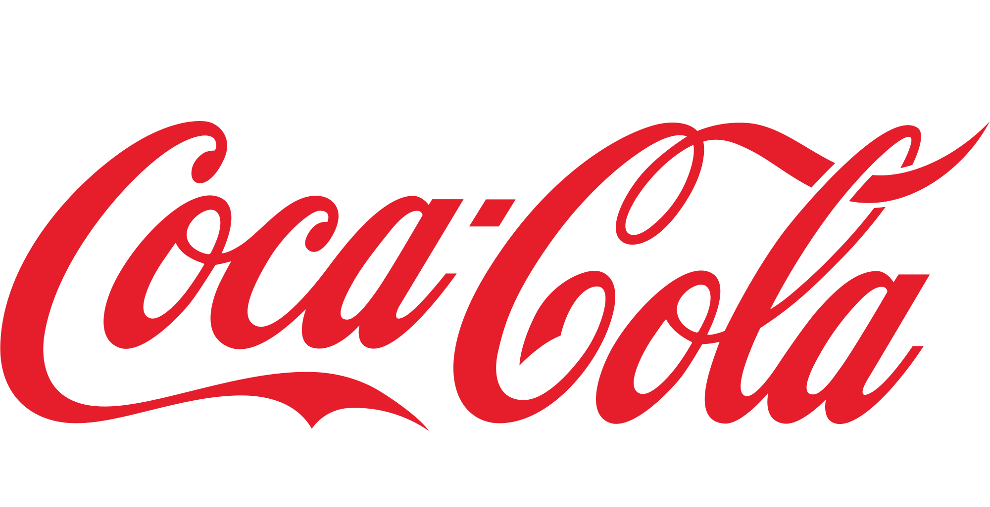
Coca-cola
Coca-Cola is a familiar example. The company name is the logo, with the typeface and color treatment giving it a distinctive appearance.
Wordmarks can work especially well when:
Your business name is short or easy to remember.
The name itself is distinctive.
You want customers to recognize and remember your name.
You prefer a simple logo without a separate symbol.
Because the name carries the entire design, font choice, spacing, capitalization, and other typographic details become especially important.
A wordmark may be less practical if the business name is very long, particularly when the logo needs to fit into narrow or small spaces.
Other familiar wordmark examples include Google and FedEx.
2. Lettermark Logos
A lettermark logo, sometimes called a monogram logo, uses initials or an abbreviation instead of displaying the complete business name.

IBM
IBM is a clear example. Rather than spelling out International Business Machines, the logo uses three recognizable letters.
Lettermarks are often a good fit when:
Your full company name is long.
Customers already refer to the business by its initials.
You need a compact logo.
The initials are easy to remember.
Like wordmarks, lettermarks rely heavily on typography because the letters themselves become the central design element.
For a newer business, however, initials may not immediately tell customers what the company is called. In that case, the full name may still need to appear alongside the lettermark in some applications until the abbreviation becomes more recognizable.
Other examples include HBO and CNN.
3. Pictorial Mark Logos
A pictorial mark uses a recognizable image, object, animal, or other literal graphic as the main visual symbol.
Apple
Apple is one of the most familiar examples. The apple symbol can represent the brand without the company name appearing beside it.
Pictorial marks can work well when:
Your business can be represented by a clear visual idea.
You want a simple, recognizable icon.
The logo needs to work well in compact spaces.
You want a symbol that can eventually stand on its own.
The image does not always need to show exactly what the business sells. It can also relate to the brand name, company story, or another idea associated with the business.
For a newer brand, however, relying entirely on a symbol can make recognition more difficult. Customers may not yet associate the icon with the business, which is why pictorial marks are often paired with the company name while a brand is still building awareness.
Other familiar pictorial-mark examples include Shell and Lacoste.
4. Abstract Mark Logos
An abstract mark uses a non-literal symbol rather than a recognizable real-world object.
Pepsi
The Pepsi globe is an example of an abstract mark. The symbol does not literally illustrate a beverage, but it has become strongly associated with the brand.
Abstract marks can be useful when:
You want a distinctive visual identity.
A literal image would feel too restrictive.
Your company offers several different products or services.
You want a more conceptual or modern visual direction.
Because an abstract symbol is not immediately self-explanatory, it often relies on repeated exposure and consistent branding to build meaning.
For a new business, this means the symbol may initially need to appear alongside the business name so customers can connect the two.
Abstract marks offer more creative freedom than literal pictorial marks, but the design should still be simple enough to remain memorable and recognizable.
One Dollar Logo Maker also offers abstract-style logo templates that can be customized for different businesses and industries.
Abstract Air Path HVAC Logo Template
5. Mascot Logos
A mascot logo uses an illustrated character, person, animal, or other figure as a central part of the brand.
KFC
KFC is a well-known example, with Colonel Sanders serving as a recognizable face for the company.
Mascot logos can work particularly well for:
Food businesses
Family-oriented companies
Children’s brands
Sports teams
Entertainment brands
Businesses that want to feel friendly or approachable
A mascot can give a brand a distinct personality and can also be reused in advertising, packaging, social media content, merchandise, and other marketing materials.
The main consideration is complexity. A detailed mascot may look great at a larger size but become difficult to recognize when reduced to a small website icon or social media profile image.
If you choose a mascot, it can be helpful to have a simplified version available for smaller applications.
One Dollar Logo Maker also includes mascot-style logo templates featuring illustrated characters and other personality-driven designs.
Chef Boy Restaurant Logo Template
Community Pet Dog Logo Template
6. Combination Mark Logos
A combination mark combines the business name with an icon, symbol, or other graphic element.
Adidas
Adidas is a familiar example. Its visual mark and brand name are often used together, giving customers both a recognizable symbol and a clear name.
Combination marks can work well when:
Your business is still building recognition.
You want customers to remember both the name and the visual symbol.
You want more flexibility in how the logo can be used.
You may eventually want to use the icon and wordmark separately.
This makes combination marks particularly practical for many small and growing businesses.
Customers do not need to guess which company the symbol represents because the name is displayed alongside it. At the same time, the symbol gives the brand an additional visual element that may become recognizable on its own over time.
Depending on the design, the text can appear beside, above, below, or integrated with the icon.
Many One Dollar Logo Maker templates use a combination-mark format, pairing a business name with an icon or graphic that can be customized to fit the brand.
Triumph Sword Crest Logo Template
Simple Shop Symbol Logo Template
7. Emblem Logos
An emblem logo places the business name, imagery, or both within a badge, seal, crest, shield, or other defined shape.
Harley-Davidson
Harley-Davidson is a recognizable example of this structure, with its name integrated into a strong badge-like design.
Emblems are often associated with tradition, heritage, authority, or community and can work well for:
Schools
Clubs
Sports organizations
Automotive businesses
Heritage brands
Businesses that want a traditional or established appearance
They can also work well on uniforms, signage, merchandise, and packaging because the design often feels self-contained.
The main drawback is that emblems can become too detailed. If the design contains a lot of text or intricate graphics, it may lose clarity at smaller sizes.
Keeping the structure relatively simple can make an emblem much more versatile.
How to Choose the Right Logo Type for Your Business
Knowing the different types of logos is useful, but the more important question is which one actually makes sense for your business.
Instead of choosing based only on appearance, consider how the logo needs to function.
Consider the Length of Your Business Name
The length and structure of your business name can immediately narrow down your options.
If you have a short, distinctive name, a wordmark may be enough to create a memorable identity.
If the business name is long, a lettermark can make the logo more compact, especially if customers already use an abbreviation.
For a newer business, a combination mark can be useful because the full name remains visible while the symbol begins building recognition.
If the brand name or business concept can be represented by a clear image, a pictorial mark may also be worth considering.
The goal is not simply to shorten the name. It is to make sure the logo remains readable and practical wherever it appears.
Think About Your Industry
There are no strict rules saying that certain industries must use certain logo types, but some formats tend to suit particular businesses more naturally.
Professional services: Wordmark or combination mark
Restaurants and cafés: Combination mark, emblem, or mascot
Technology: Abstract mark, wordmark, or combination mark
Children’s brands: Mascot or playful combination mark
Luxury businesses: Wordmark, lettermark, or simple combination mark
Sports teams and clubs: Mascot or emblem
For example, a law firm may prefer a clean wordmark or lettermark because it creates a straightforward and professional impression.
A family restaurant, on the other hand, might benefit from a mascot or combination mark that gives the brand more personality.
Use these as starting points rather than fixed rules. What matters most is whether the logo fits your individual business and audience.
Match the Logo to Your Brand Personality
The structure of a logo can contribute to the way people perceive the brand.
For example:
Traditional or established: Emblem
Minimal or sophisticated: Wordmark
Friendly or playful: Mascot
Modern or innovative: Abstract mark
Straightforward and versatile: Combination mark
These are not limitations. A combination mark, for example, can look playful, luxurious, traditional, or modern depending on the typography, colors, imagery, and overall design style.
Think of the logo type as the framework and the visual style as the personality layered on top of it.
Think About Where Your Logo Will Be Used
A logo rarely appears in only one place.
You may need to use it on:
A website header
Social media profile images
Packaging
Signage
Business cards
Merchandise
Advertising
Mobile screens
App icons
The logo should remain clear and recognizable across these different formats.
A detailed mascot or emblem may work well on a large sign but lose important details when reduced to a small social media avatar.
A simple pictorial mark can work extremely well at small sizes, but a new business may also need a version that includes its name.
Considering these applications early can help you choose a logo type that is easier to use consistently.
Consider How Established Your Brand Is
Brand recognition also affects which logo type makes sense.
Large, established brands can sometimes use a standalone symbol because customers already know what the image represents.
A small apple symbol, for example, is enough for many people to immediately recognize Apple because the company has spent years building that association.
A new business usually does not have that advantage.
If customers have never heard of your company before, showing the business name clearly can help them connect the design with the brand. Wordmarks and combination marks can therefore be particularly useful during the early stages of a business.
As recognition grows, you may eventually be able to use a simplified icon or symbol in certain situations.
Quick Logo Type Decision Guide
If you are still unsure which type to choose, use this as a simple starting point:
If your business.. | Consider |
|---|---|
Has a short, distinctive name | Wordmark |
Has a long business name | Lettermark |
Needs customers to learn the business name | Combination mark |
Can be represented by a recognizable image | Pictorial mark |
Wants a unique, non-literal visual identity | Abstract mark |
Has a fun or approachable personality | Mascot |
Wants a traditional or heritage appearance | Emblem |
You do not have to follow this exactly, but it can help narrow down your options before you start comparing designs.
What About Different Logo Styles?
Choosing the logo type is only part of the decision. You also need to consider the visual style.
Common logo styles include:
Minimalist
Modern
Elegant
Playful
Vintage
Bold
Hand-drawn
The same logo type can look completely different depending on the style.
For example, two businesses could both use a combination mark. A technology company might use clean typography, simple geometric shapes, and a minimalist layout. A bakery could use hand-drawn illustrations, softer typography, and a vintage-inspired design.
Neither approach changes the underlying logo type. It simply changes how that structure expresses the personality of the brand.
If you are unsure what visual direction fits your business, browsing different logo ideas can help you compare styles before making a decision.
Can Your Business Use More Than One Logo Type?
Yes. You do not necessarily need to use one exact logo version everywhere.
Many businesses create a small logo system with different variations designed for different situations.
For example, a brand might use:
A combination mark as its primary logo
A standalone symbol for social media profile images
A wordmark for wide website layouts
A simplified version for very small spaces
These versions should still share the same visual identity, such as consistent colors, typography, and imagery.
Having several coordinated versions can make the logo more flexible without making the branding inconsistent.
The important thing is that customers can still recognize that each variation belongs to the same business.
Find a Logo Style That Fits Your Business
Once you understand the different types of logos and have an idea of which structure fits your business, looking at actual designs can make it easier to decide what you like.
One Dollar Logo Maker offers templates that include abstract marks, mascot-style designs, and combination marks across different industries. You can browse available designs and customize elements such as the text, colors, fonts, layout, and other parts of the logo to better suit your brand.
If you are ready to create your own logo, you can also read our guide on how to create a logo using AI for a step-by-step walkthrough of the process.
Frequently Asked Questions About Types of Logos
What are the 7 main types of logos?
The seven common types of logos are wordmarks, lettermarks, pictorial marks, abstract marks, mascots, combination marks, and emblems.
Each uses a different balance of text, symbols, and imagery, so the right choice depends on your brand, business name, and where you plan to use the logo.
Which type of logo is best for a small business?
There is no single best logo type for every small business.
A combination mark can be particularly practical for a new or growing business because it displays both the company name and a visual symbol. This helps customers learn the brand name while also beginning to recognize the icon.
A wordmark may also work well if the business has a short and memorable name.
What is the difference between a wordmark and a lettermark?
A wordmark displays the full brand name, while a lettermark uses initials or an abbreviation.
Google is an example of a wordmark because the complete company name forms the logo. IBM is a lettermark because it uses initials instead of spelling out the full company name.
What is the difference between a pictorial mark and an abstract mark?
A pictorial mark uses a recognizable image or object, while an abstract mark uses a non-literal symbol or shape.
Apple is an example of a pictorial mark because its logo uses a recognizable apple. Pepsi is an example of an abstract mark because its circular symbol does not literally represent the product.
Can a business use more than one type of logo?
Yes. A business can use several coordinated logo variations.
For example, it may use a combination mark as the primary logo, a standalone icon for social media, and a wordmark for certain layouts.
The variations should still use consistent design elements so they remain recognizable as part of the same brand.
Which logo style is best for my business?
The best logo style depends on your industry, audience, brand personality, business name, and where the logo will be used.
A modern technology company may prefer a minimalist or abstract design, while an artisan business might prefer something more traditional, hand-drawn, or vintage.
Rather than choosing a style based only on trends, look for one that supports the impression you want customers to have of your business.